
Showing posts with label Still life. Show all posts
Showing posts with label Still life. Show all posts
Monday, May 16, 2011
Three Tulips, 6x8"


Saturday, May 14, 2011
Values, poster study—The Lady, 6x8"

In case you haven't figured out what you're looking at (color here would help), I'm sure you must see what I do: it's a Lady, dressed ever so elegantly. (Okay, it's an ice cream dish overturned, with a clementine sitting on top—it's bottom.)
Friday, May 13, 2011
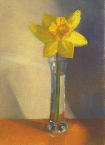
A Daffodil, 5x7"
Sunday, April 24, 2011
Great-Grandmother's Threads 2

Wednesday, April 20, 2011
G is for Gertrude

Saturday, April 16, 2011
Egg and Spoon, limited palette

Once again, this is a scanned painting and I did adjust the colors to try to better match what it looks like to me, but be warned—who knows if it's "accurate"? Moving on...
Friday, April 15, 2011
Primary Pears, triptych, sold

It's been a very busy, but good time this past week. I just wanted to thank all of you who stopped by the Melrose Arts Festival. This was my second year participating. Once again, I enjoyed so much getting to meet art appreciators and other artists. My triptych set, Primary Pears, found a wonderful home! (These three are from pre-blogging days.) The rest of the sold paintings are on this blog, except for Mary's Flowers, a small painting I did, (but forgot to document), when a few of us painted at Mary Taggart's studio. I've updated the posts with "sold". If they come to you as new posts, I apologize.
Interestingly, two artist friends from Band of Brushes commented on how much better my work looks in person. I've been scanning my paintings since they're small. Now I'm wondering if the quality isn't as good as I thought. It's time I learned how to photograph them, I guess!
Thursday, April 7, 2011
Strawberry Chick, 6 x 8"

Monday, April 4, 2011
A Sip of Spring, 5.25 x 5.5"

Thursday, March 31, 2011
Plopped on a Pitcher, 6 x 6"

Friday, March 18, 2011
Which Comes First...?

Which brings us to the totally metaphorical title.
Do you go through periods where you think you're "getting it" and then suddenly you're certain you know absolutely nothing about painting? When I reach that point I try to be kind to myself (it's not always easy) and just keep working. I tell myself that eventually I'll master some small aspect of the painting problem and I'll be a better painter for all the struggle! I HAVE seen it happen!
I'm at a point where as some say about art, "I know what I like," but I have to finish with: I don't yet know how to do it. AND, I'm not certain what "my painting voice" is yet, since I can point to several artists whose very different painting styles I admire so much (some of you know who you are). My artist friend, Sarajean Graham, and I have hatched a plan: to embark on an organized course of self-education. Together we're going to examine things we've wondered about, groused about and struggled with. We plan to conquer them! Stay tuned. (and do wish us luck!)
Happy Spring!
Wednesday, March 2, 2011
Bob Lobster on Leather Chair, 6 x 6"

I painted this in response to Carol Marine's latest challenge on this week's Daily Paintworks website. Click "Daily Paintworks" to see what others have submitted.
Each brushstroke was supposed to be a new color. I started off well. Really well. I was having a great time when I suddenly noticed my brush had stroked my painting more than once with the SAME color! It was a challenge, surprise, surprise; one I hope to try again on my own.
The hat is from Bob Lobster, a small restaurant in Newbury, on the way to Plum Island. I've painted in the area and eaten there—yum! I can't wait to go back when spring is in full swing.
Sunday, February 27, 2011
Spring must be coming! Sunflower Bouquet, 6 x 8"

Saturday, February 19, 2011
Andrea's Shoe, 5x5", pencil

Wednesday, February 16, 2011
Andrea's Shoe, 6 x 6 "

You may have wondered, as my loyal art supporter and critic John has, why my subject matter is all over the place. I'm sure there's a thread of me tying it all together; right now I guess my paintings reveal that I'm drawn to a variety of subjects. My internal voice says, "Ooh! look at that! Ooh! did you see those colors? Can I do that?"
I expect I'll settle down soon. This shoe, for instance, deserves a few drawings and paintings. Let's see where it takes me. If another landscape or person pops in here and there, don't be surprised. I'm drawing people a lot behind the scenes and outdoor scenes appeal to me, too! ; )
Saturday, February 5, 2011
Lemon and Garlic, 6 x 6"

Monday, January 31, 2011
Paint Table, 6 x 6"

Here's a change of subject, painted in a limited palette. I have discovered that of my paintings, the ones I usually like the least are those that muddle in the middle. Meaning, the value range is narrow and there aren't extreme lights and darks. Sometimes, that's great to evoke a certain mood. In this painting, I was aware that the scene would be mostly in the middle, but I tried include the dark and light accents. Do they offer enough contrast and interest? I'll give this some thought (and maybe play with it on my computer, to see). On to the next!
Saturday, January 29, 2011
Keep On Truckin' 2, 9 x 12", cropped

Why, you ask? Why another truck with eggs? Because, I'm learning!
I think the drawing here is more accurate and perhaps the composition feels more comfortable than my original 12 x 12" painting (still to come in it's finished state). I was more aggressive in the colors I used—there's more contrast in the lights and darks of the eggs and the blue background is more saturated. I'm not saying it's better overall, just stating what's different. Do stay tuned, if you dare, to see the final 12 x 12" painting. I'll post new paintings after this, for a change of subject. Whew.
Friday, January 28, 2011
Keep On Truckin', color study, 6 x 6"

Saturday, January 15, 2011
Keep On Truckin', 12 x 12"

Subscribe to:
Posts (Atom)