Thursday, December 1, 2011

Settling In and Open House


I hope to be at the Holiday Open House on Friday, December 9th, 6-8pm. 
If you can, pop in and see the art and say hello to the artists who will definitely be there!
 
I've been working on some larger paintings lately, while getting things moved into my new studio. What a challenging process it is, to get all set up, but I cannot complain! It's awesome and inspiring to have this space to paint in, with kind, talented, and hardworking artists as neighbors.

Happy Holidays, everyone. Wishing you a joyful season.

Tuesday, November 1, 2011

The Artists' Muse Reception

Hi All,

I'm excited to announce that very recently (like a week ago) I started sharing a studio with artist Brent Rotsko, in Amesbury, MA. So, of course we're working hard to be ready for this Friday's Reception. Amesbury's 15th Annual Open Studio Tour takes place this Saturday and Sunday.

The Artists' Muse
9 Water Street
Amesbury, MA

Reception
Friday, November 4
6-9 pm

Amesbury's 15th Annual Open Studio Tour
Saturday, November 5
10 am-4pm
Sunday, November 6

For awhile now, I've known that my blog title arrives garbled in emails. I'm testing this new, simplified template and hope this fixes the problem. I have a new website, too and would love to hear what you think: www.pamperras.com

If you're in Amesbury, please stop by and say hello!
Cheers!

Thursday, October 20, 2011

Silent Pines of Grace

Tuesday was overcast, but beautiful in New Hampshire. Leaves are just beginning to change color. I could hear the pattering of raindrops, but didn't feel them; the trees sheltered me. Once the rain stopped, it was so quiet. Pine needles carpeted the path. I enjoyed a mini-vacation in Grace's neighborhood.

Friday, October 14, 2011

Paint Out Speed Painting!


Here is my painting from that gloriously beautiful day, at The Wakefield Paint Out by the Lake. Having organized the event, I spent more time working on it than at my easel for about a month, so it was such a treat to be out there painting, FINALLY!

Whether you're an artist or art lover, if you're in the area in 2012, please consider joining us! The Farmers Market, where it's held, is one of the best around, The Wakefield Paint Out is great fun, and it's a pleasure to meet other artists and art lovers. We're going to be working on The Paint Out way in advance next year, so you'll receive ample notice. 

Thanks again to: The Savings Bank, Sponsor; Wendy Dennis, Wakefield Farmers Market Manager and The Crew; Kendall Inglese, Executive Director, Wakefield Chamber of Commmerce, artist Robin Thornhill, Lynnfield Art Guild, Merchants of Wakefield who participated in the Art Walk; Lady with a Pen, Sanborn Day Adult Day Care, Greenwood Wine & Spirits, Ristorante Molise, Tootsie's Coffee Corner, ZuZu's Cafe & Catering, The UPS Store, Kelli Stromski, Maura Racamato, Cathy Wensley, The Center for Performing Arts, and All the Paint Out Artists!

Tuesday, October 11, 2011

Wakefield Plein Air Paint Out!


It was a gorgeous, perfect day for plein air painting in the Paint Out by the Lake at Wakefield Farmers Market this past Saturday. It looked festive as can be, with red balloons floating above artists' easels. As the organizer and greeter of artists, I got off to a late start, but had a great time anyway—speed painting! This photo, courtesy of Kendall Inglese, shows the artists exhibiting their finished paintings at the Wet Paint Exhibit and Sale.

This year the Paint Out is donating 20% of proceeds to The Wakefield Center for Performing Arts, a new and state-of-the-art theater that has already wowed local audiences with jazz concerts, theater performances and lectures. It's always a challenge asking people for money to support causes. This one's worthy. Soon enough their reputation will precede them and enthusiastic support will come from loyal customers and businesses who want to be a part of a great thing.

Now that this event is done, I'll be painting more! (Yay!) See you soon.

Tuesday, October 4, 2011

Plein Air Paint Out this Saturday

I've been super busy organizing the third annual Paint Out. This year we've gotten businesses to host an Art Walk. What an undertaking. Next year must be easier! I have ideas already on how to streamline the process, thank goodness.

Artists can still register the day of the Paint Out. If you live locally, enjoy a morning at the Farmers Market and watch artists paint! It's going to be SUNNY on our last chance rain date! : )

Monday, September 19, 2011

Potential

Here's the second painting I did at Amy's, while spending the morning with Band of Brushes friends.

It's can be exhilarating to paint with such intensity (and speed) as I did on that overcast day. The concentrated looking and the trusting of instinct that's required, feel like a good workout when I'm done! I learn a lot when I change my approach to painting now and then.

Thursday, September 15, 2011

Amy's Garden

This is one of my favorite paintings from this summer. I experimented with my block-in, using transparent oxide red and viridian. I painted two small painting that day in Amy's garden. I was determined to paint like there was no tomorrow, since it was my first time painting with Band of Brushes in so long! It was great to see friends.

Amy, a generous acquaintance of one of our members, and a talented artist and quilter, http://duringquiettime.blogspot.com/, invited our group to paint on her property. I guess I was pretty excited to be painting. It wasn't until I returned home that I saw that I had forgotten to wear my glasses while painting! Thus, the lovely, painterly quality! I may paint sans glasses more often!

Tuesday, September 13, 2011

Backyard Coneflowers

This painting was done quickly during a much-needed break this summer. I wasn't able to venture far, so it was nice to find models who agreed to pose for me right at home.

Thursday, September 8, 2011

Stefan at the Hatch Shell

My younger teen on a rainy day in Boston. A little less rainy than today. Stefan's older brother, Marc, played piano with the high school jazz ensemble. At the Hatch Shell! The dampness didn't dampen our spirits. All the performing high school jazz bands had our feet tapping. It was very cool.

Wednesday, September 7, 2011

Thankfulness

It was difficult for me to post to my blog after such an emotional time. My Dad passed away two months ago, on July 6th. I sketched this while chatting with him during a visit at Rehab. He was 94 years old, and leaves behind my Mom, who is 84. A World War II vet who fought in the Battle of the Bulge, Dad received a Bronze Star and Purple Heart. But that's not all, of course.

You know, from a distance, one can be philosophical and say, "How fortunate; he lived such a long life." And although that's true (and I've thought that of others in the past), I've come to realize it doesn't begin to touch on the personal, complex feelings, that include loss and also, for me, the positive way he touched so many lives in our family. He was a gentle man and a gentleman, of that notable generation, with strong values and a nice sense of humor. He led by example and was loving and good-humored until the end. All of my siblings felt he became the essence of Dad in the final days. We are grateful to have had him as long as we did!

Friday, June 17, 2011

Returning soon...

Dear Visitors,

It's been such a busy time, with Life Events occurring in this order:
  • work done—and re-done correctly—on our house,
    (good for us and the environment, but ever-so-frustrating);
  • scary, emergency-type illness of my Dad (now in rehab, which is good);
  • an end-of-the-school-year tragedy that caused hearts to break;
  • and finally, happy events of my sons and their cousins.
Treasure the people you love, use your time wisely, give a little to others! :)

I hope you're all well.
See you soon,
Pam

Thursday, May 26, 2011

Son, 11 x 14"

Well, you've met the kitties. This is my son, Stefan, proud owner of Fred and Jacques. Working from a photo, which I haven't often done, I found it easier to focus on other aspects of painting. The drawing stage is easy since Stefan didn't move a bit! The fact that it's already two dimensional made it easier to see the colors and values of the photo, too, I suspect. I started this painting in Cameron's class and once again, was so excited, I couldn't wait to work on it at home. I stayed up late and nearly finished it and then tweaked it once or twice after that. I'm glad I captured Stefan in his teens. Now I need to do another painting of my older son, Marc, using what I've learned. Hopefully Marc will pose for me again...live. (I do prefer that!)

In between, I've experimented on my smaller paintings using Liquin and then no medium, thin, thick, fluid and not. Eventually I'd like to combine techniques. So much to learn and sometimes it feels like there's so little time! Having fun, though. Thanks for visiting!

Tuesday, May 24, 2011

Kitties! Meet Fred and Jacques, 6x8"

Over the last few months, our younger son has been begging and then showing his maturity and readiness to care for his/our new family members: Fred and Jacques. The brothers put smiles on our faces with their antics. Although I'm helping Stefan out a little with the cat chores, he's doing a really good job! For this commissioned portrait, Stefan has asked me to work a little bit more on their eyes.

Monday, May 23, 2011

After Degas—Portrait of a Young Woman


Every once in awhile I love to copy a master painting. From exercises like this I can learn so much: color mixing, painting techniques that are new to me, composition, and even drawing skills. Because I initially had such difficulty with the painting, I stopped and drew her first.

Sunday, May 22, 2011

After Sargent, Carmela Bertagna, 11" x 14"

I thought I'd catch you up with other work I've been doing. I'm taking a class with Cameron Bennett, concentrating on portraits. Use of any medium is not allowed where the class is held, so we do without it. What an experience! I actually enjoyed it. I was so excited that I couldn't wait to work on it once I returned home (at 9 pm). I forgot that I tried painting without medium once before, but it didn't feel comfortable to me then. I loved the ease of sketching lightly with paint to start and then building up the paint, making it thicker. This photo was taken in north light (the canvas looks very cool); I used my cell phone, since I had no camera handy!

Monday, May 16, 2011

Three Tulips, 6x8"

I learned a lot from this one, and with more reflection, (in my head, not on the vase), I think I'll understand more. Down time is so important for looking at your work, understanding what you've learned, and what you need to improve. I'm very happy with the vase and wonder if parts of the main flower need to be darker or lighter. Sarajean rightly pointed out that the cast shadow of the vase should be darker. It was—at one point in the painting process! Why did I change it? I don't know. I wasn't careful with my value families! I definitely need to fix that. So, I'm about to give myself a little time to look, learn, and regroup. I'll be back—so see you soon!

Sunday, May 15, 2011

Value Study, The Youngster. 5x7"

I painted this after "The Lady". I was careful to use the five-value scale and took some liberties in blending some of the paint. Guess what? The shadow on the shelf needs to be darker! Notice, the light side of the brown egg is the same value. Paint and learn! So is part of the shadow on the wall. Perhaps my five-value scale didn't offer enough values? I will tweak this though, and see what happens. Right now the candlestick looks like it's floating. Can't have that!

Saturday, May 14, 2011

Values, poster study—The Lady, 6x8"

Here's an exercise I did with Sarajean. We mixed our values carefully and applied the paint in an organized way so we could see and understand the effect.

In case you haven't figured out what you're looking at (color here would help), I'm sure you must see what I do: it's a Lady, dressed ever so elegantly. (Okay, it's an ice cream dish overturned, with a clementine sitting on top—it's bottom.)

Friday, May 13, 2011

A Daffodil, 5x7"

This daffodil from the garden posed such a challenge, as do all flowers for me. The colors are so subtle; the shift from warm to cool can be surprising. I may try to tweak this if I can figure out what it needs. I may have violated the value families! eek. It could be that the petals in the shadow should really be darker. What do you think? Yellows sometimes confound me. How about you?

Thursday, May 12, 2011

Forsythia at the Lake—Study, 6x8"

Well, one misty, overcast, drippy day I drove to local Lake Quannapowitt to paint "en plein air" from my car.  Here you have it.

There's a story the painting doesn't reveal: while painting from my car I listened to the radio. The day warmed up as I was nearing the end of my painting session. It was humid and warm. I turned on the air (not a/c) and opened the windows. Suddenly my radio stopped working! YES! My battery died. Happily AAA came to the rescue in time for me to pick up my son from school. Silly me. Lucky me.

Wednesday, May 11, 2011

Values—Teapot, 6x6 inches


After the sphere, it seemed natural to paint Sarajean's teapot. We premixed the values and then happily applied paint, not really adhering to a systematic approach. From classes I took with Dennis Perrin, I learned the importance of keeping the value families distinct. (And that's what I'm still trying to master!) Whatever is in the shadow stays in the shadow value range. The lights stay in the value range for the lights. You've may have heard the seemingly confusing statement: the darkest dark in the light is always lighter than the lightest light in the shade. (I am now feeling confused myself! I hope I wrote that correctly!) If you've never experienced this or can't imagine it, you could put a black piece of paper in the light and a white piece of paper in the shade and check it out!

Related to that, reflected light in a shadow (as you see in the belly of the teapot) often appears to be lighter than it actually is. Why? Because it's surrounded by darker values. A small hole punched in cardboard can help you isolate the colors and compare them. It's easy to overstate the lightness of reflected light. To make it convincing, I always try to keep it in the value range of the darks. (Thank you Dennis Perrin.)

Tuesday, May 10, 2011

Values


 It has been awhile, I know. Life has been hectic. But, I have been painting! Just not blogging. Sometimes you have to choose which balls to keep up in the air (pun unintentional, but why not?!) I'll catch you up on my efforts.

If you don't receive Fine Art Views Newsletter, you may wish to check it out: http://faso.com/fineartviews/30732/put-the-fire-out. Keith Bond's article that arrived in my email this morning touches on just what Sarajean and I have discovered: we need to address and master one problem at a time and have decided to focus on values to start. Occasionally I'll share what we do.

We painted value scales to help us understand the intervals from white to black. As you can see, we did a ten-step value scale, then nine (thinking it would be easier to mix and judge steps that are equidistant from others, since we painted the white and black first, and then mixed the value between each time), then five, which would be good for poster studies. In these exercises, we mixed a black using black and burnt umber, so it would dry faster and not be tacky once dried. We used palette knives to mix and paint, to keep the values clean. I'm not positive my value steps are evenly spaced, but they're close, I hope! Expert eyes would be so welcome, but I imagine even imperfect exercises could lead to eventual mastery.

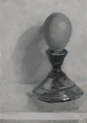
The sphere here, was painted prior to the formal value scales, but we did limit ourselves to five values to begin, I think. We also allowed ourselves to play with warm and cool temperatures. Rather than keeping it a simple poster study, I tried to figure out how to paint it "realistically." Perhaps this dealt with more than one problem! oops.

Independently, Sarajean and I will practice our exercises and continue to paint whatever and however we wish. If you'd like to share exercises that you found helpful, please do! I'll be happy to make your comments visible so we can all benefit. I expect to be posting more frequently since other demands are quieting down some. Take care and thanks for visiting!

Sunday, April 24, 2011

Great-Grandmother's Threads 2

Here's another painting of my great-grandmother's sewing threads. I kept the same general set-up, but altered the lighting. I'm not sure I want to do a detailed rendering of the lace at the bottom. So far, I've been happy to suggest it. My younger son feels it's incomplete. Although I respect his opinion, if any of you (of more artistic experience) would like to offer a constructive critique, I'd appreciate it! : )

Friday, April 22, 2011

Coffee in Amesbury

Ever get so busy you forget what's what? Sarajean and I were supposed to meet and paint (I thought) and so I drove to Amesbury last Thursday and...it wasn't our day! So I popped into our favorite coffee haunt, Zac & Ani's Bread, and Brian kindly let me paint there. I loved painting this, but it doesn't quite capture the colors and lighting the way I envisioned. I know from reading other blogs (and from some experience), that paintings improve when you paint a subject more than once. On to the next! I will rethink a lot of this painting.

Wednesday, April 20, 2011

G is for Gertrude

I had a great time lighting up this little "landscape" of small balls of thread. My great-grandmother did tatting, embroidery, crochet—all sorts of beautiful work with thread. The "G" is for Gertrude.

Monday, April 18, 2011

Prom Dresses at Rada's, Wakefield

I've mentioned Mary Taggart, a local artist I paint with now and then. We couldn't resist standing on Main Street one very chilly, windy Sunday, to paint Rada's window display. My easel blew over before we even got started and the sunlight lit up the shop window, as well as our canvases (bad glare!), so we turned our easels sideways to the subject and turned our heads back and forth to paint! Such are the challenges and fun, of plein air painting. We had a blast. My painting looked rather sketchy when we called it quits and I finished it up at home—as a sketch...study? What's the difference? Anyone know? Can't wait to go again. Ready, Mary?

Saturday, April 16, 2011

Egg and Spoon, limited palette

This still life is done with a limited palette, using burnt sienna, ultramarine blue, yellow ochre light, and titanium white. Claudia Hammer's limited palette sugar bowl painting inspired me to add yellow ochre to my mix. Check out Claudia's teapot series, as well as her blog in general. She does beautiful work!

Once again, this is a scanned painting and I did adjust the colors to try to better match what it looks like to me, but be warned—who knows if it's "accurate"? Moving on...

Friday, April 15, 2011

Primary Pears, triptych, sold

It's been a very busy, but good time this past week. I just wanted to thank all of you who stopped by the Melrose Arts Festival. This was my second year participating. Once again, I enjoyed so much getting to meet art appreciators and other artists. My triptych set, Primary Pears, found a wonderful home! (These three are from pre-blogging days.) The rest of the sold paintings are on this blog, except for Mary's Flowers, a small painting I did, (but forgot to document), when a few of us painted at Mary Taggart's studio. I've updated the posts with "sold". If they come to you as new posts, I apologize. 

Interestingly, two artist friends from Band of Brushes commented on how much better my work looks in person. I've been scanning my paintings since they're small. Now I'm wondering if the quality isn't as good as I thought. It's time I learned how to photograph them, I guess!

Thursday, April 7, 2011

Strawberry Chick, 6 x 8"

You may have noticed this little chick before. Here I experimented with a totally different way of working...looking and painting slowly. It's a totally different effect. I enjoyed layering colors in this one. SOLD

Monday, April 4, 2011

A Sip of Spring, 5.25 x 5.5"

This cup makes me think of Spring. It also invites indulgence, which is how Spring makes me feel. Surrounded by budding trees, crocus blooms and birdsong, I want to take time and enjoy it all—personally and in paint! For all of us who have endured a long and snowy winter—enjoy this new season! SOLD

Sunday, April 3, 2011

Guess where I'll be?


This is my second year participating in the Melrose Arts Festival. Opening night is a wonderful party with great music and refreshments. Held inside historic Memorial Hall, it's a comfortable location with places to sit, enjoy the food, art and people. Regional artists exhibit paintings, ceramics and jewelry. If you're in the area, I hope you'll stop by and say hi!

Friday, April 8, 7-9 pm (Preview Party, $10 admission)
Saturday, April 9, 12-7 pm
Sunday, April 10, 11-5 pm

Thursday, March 31, 2011

Plopped on a Pitcher, 6 x 6"

Sarajean and I had our first painting session together last week. It took awhile for this paint to dry! (I applied the paint more thickly than usual.) Our limited palette consisted of Ultramarine Blue, Burnt Sienna, and White. We set up this small pitcher on a cloth and perched a clementine on top, inside a black box that Robin Thornhill had in her studio. She graciously let us use her more centrally located studio, so Sarajean and I could get together (from New Hampshire and Massachusetts). Thanks again, Robin! Both Sarajean and I wiped out others that day, but feel this is a great exercise and we'll do it again, respecting our timer when it rings! Won't we, Sarajean? : )

Monday, March 28, 2011

Spring Mist in Newbury, 5 x 7"


Dear Visitors, I want to thank you for your interest and for sharing the artistic journey! Your comments mean so much to me and I appreciate all that I learn from the painters whose blogs I follow. Sometimes it's a challenge to keep up with the blogging when other things in Life demand attention, as we all know. I have great respect for those who keep it all going regardless. I have several small paintings that are slowly drying and I'll post them soon. (I haven't been totally slacking!) Meantime, I'm doing the Life Juggle!

Many artists take small plein air paintings and create larger ones in the studio. I did the reverse with this one. I painted a smaller painting from my plein air study so I could easily experiment with several aspects...colors, composition, and—how to paint a tree! : )

See you soon!

Friday, March 18, 2011

Which Comes First...?

Well, spring is just about here and I couldn't help myself. I wanted to see if I could control a colorful set up, be more conscious of trying to use one color per stroke (not there yet!), and how to achieve transitions using this technique. I'm still finding my way!

Which brings us to the totally metaphorical title.
Do you go through periods where you think you're "getting it" and then suddenly you're certain you know absolutely nothing about painting? When I reach that point I try to be kind to myself (it's not always easy) and just keep working. I tell myself that eventually I'll master some small aspect of the painting problem and I'll be a better painter for all the struggle! I HAVE seen it happen!

I'm at a point where as some say about art, "I know what I like," but I have to finish with: I don't yet know how to do it. AND, I'm not certain what "my painting voice" is yet, since I can point to several artists whose very different painting styles I admire so much (some of you know who you are). My artist friend, Sarajean Graham, and I have hatched a plan: to embark on an organized course of self-education. Together we're going to examine things we've wondered about, groused about and struggled with. We plan to conquer them! Stay tuned. (and do wish us luck!)

Happy Spring!

Sunday, March 13, 2011

Sardonic Son, 16 x 12"

This is where I am right now. I remind myself often that there's so much to learn. Impatience, be gone!

Here's my older son, painted from life. He's not all that lively looking, since I let him watch a movie on the computer while I painted him. What an excellent, conscientious model he was, though. Who knew?! He carefully assumed the same position each time after getting movie snacks. I may ask him to pose again, sans movie, since he was so good, with the hope of achieving the kind of likeness I enjoy each day. The hands are sketchy since it was a great challenge just to get the face as you see it. I see errors in my drawing and that's good.

Here's the question: what do I do with this? Leave it as a learning experience and move onto the next or see if I can lure my model back so I can improve and "finish" it? By the way, when my son saw the painting, he was genuinely amused and laughed at how "sardonic" he looked. Title courtesy of son.

Friday, March 11, 2011

Honest—Abe, oil, 6 x 4.5"

I'm finally on the mend. When we were around 4-years old, my twin sister and I were sick at the same time (surprise!) and we were drifting in and out of feverish sleep in our parents' bedroom (easier access for our Mom). It made such an impression on me, how slowly time seemed to pass. This time, I felt that same sensation of time slowing. I'd like to hold onto that feeling once I get back into full swing of things. Goal: Be healthy, but enjoy Pockets of Slow Time.

This little painting is in response to the Daily Paintworks Challenge, part one: Using Ultramarine Blue, Burnt Umber and White, paint Abraham Lincoln in a neutral gray. I don't remember ever painting this way before, although I've read about it. Great exercise. Click here to see the many paintings submitted to this challenge: Daily Paintworks Lincoln Challenge.
Honest—Abe, 6 x 4.5", $50 SOLD


Wednesday, March 2, 2011

Bob Lobster on Leather Chair, 6 x 6"


I painted this in response to Carol Marine's latest challenge on this week's Daily Paintworks website. Click "Daily Paintworks" to see what others have submitted.

Each brushstroke was supposed to be a new color. I started off well. Really well. I was having a great time when I suddenly noticed my brush had stroked my painting more than once with the SAME color! It was a challenge, surprise, surprise; one I hope to try again on my own.

The hat is from Bob Lobster, a small restaurant in Newbury, on the way to Plum Island. I've painted in the area and eaten there—yum! I can't wait to go back when spring is in full swing.

Sunday, February 27, 2011

Spring must be coming! Sunflower Bouquet, 6 x 8"

I painted this bouquet while gallery sitting at the Newburyport Art Association last year. We awoke to three inches of new snow this morning and I'm feeling I'm eager for spring, buds and flowers. Winter can be great, but I am ready for the thaw!

Friday, February 25, 2011

Portrait in Progress

I just returned home the other day after taking my older son, seen here, to visit colleges. Its such an exciting time for him and for us. Unfortunately, I brought home a bad cold, too. Hoping to be feeling better very soon!

Since I usually work from life, painting from a photograph is a challenge for me. I'm going to consider this stage an underpainting and will spend today carefully mixing colors and thinking about my next moves! The size is 11 x 14, and what you don't see here is a little more of my younger son in the foreground on the left and a bit of the scene on the right. Technically, I'm nervous about how to proceed...is it better to use retouch varnish? "oil it out"? scumble paint on top of what I've done? I imagine I'll learn a lot by doing.

Wish me luck!

Saturday, February 19, 2011

Andrea's Shoe, 5x5", pencil

This drawing got me thinking about values and the challenge of keeping the light family separate from the darks. I'm not sure I entirely achieved my goal, but the thinking part is good! Sometimes when I paint, I feel like I need to slow down and be more thoughtful about my observations. I have a feeling that drawings can help. Hmmm, maybe doing more VALUE paintings would help, too! Now, there's a thought.

Wednesday, February 16, 2011

Andrea's Shoe, 6 x 6 "

My friend Andrea gave me a bag of wonderful, vintage sample shoes that I plan to explore in my still life paintings. I couldn't resist pairing this with tissue paper that caught the light and reflected colors of this amazing fabric.

You may have wondered, as my loyal art supporter and critic John has, why my subject matter is all over the place. I'm sure there's a thread of me tying it all together; right now I guess my paintings reveal that I'm drawn to a variety of subjects. My internal voice says, "Ooh! look at that! Ooh! did you see those colors? Can I do that?"

I expect I'll settle down soon. This shoe, for instance, deserves a few drawings and paintings. Let's see where it takes me. If another landscape or person pops in here and there, don't be surprised. I'm drawing people a lot behind the scenes and outdoor scenes appeal to me, too! ; )

Monday, February 14, 2011

Remembering Snow II, 6 x 6"

We've had so much snow this winter. As I drive around, I can't help but marvel at the beauty and subtlety of colors and values. Sometimes, it's all so soft I can barely make out the distinction of one tree against others. It's a shift of warm to cool within the same value. I really should carry a camera with me, too, since my memory fails me at some point in the painting process! But, it's fun to do these memory paintings now and then. Maybe mine will improve!

Friday, February 11, 2011

After Sargent, Head of a Capri Girl, 8 x 10"

Head of a Capri Girl by John Singer Sargent


What an experience, to carefully look and attempt to copy a painting by a master!

My darks could be darker and I should use more paint and medium, since the thinner paint seems to have been absorbed by the canvas. My drawing and colors are a bit off, which is so clear when I look at these small, posted images. (Want a good laugh? In my painting, her ears must be pierced in different places! The earring on our left is too high.)  In the future, I'll try viewing my work in a mirror and see if that helps. It was a lot to take on, but what a blast to do! I can definitely see the value of exercises like this.

In the meantime, I'm working on a portrait of my older son, from a photograph. Stay tuned, and thanks so much for visiting.

Thursday, February 10, 2011

10 Minute Pears, 8 x 16"

In an afternoon of fast-paced painting, I completed Carol Marine's challenge: Choose a simple subject and paint it in eight different "poses," 10 minutes for each pose. Whew! I have to confess, I think I "cheated"on two of them, painting for 12 instead of the 10 minutes. I think I got tired toward the end; it's surprisingly difficult to maintain the concentration to do it "justice". BUT, if you're a painter and you've tried this before, you know it's an excellent exercise. If you're a painter, and you haven't tried this (and really kept to the time), you don't know what you're missing! Join in and see the benefits! I plan to do more on my own. Here's the link for the Painting Challenges: http://www.dailypaintworks.com/Challenges

Wednesday, February 9, 2011

Face Sketches, 8.5 x 11" paper

I've been sketching faces lately, both real and imagined. If you've visited before, you know I've been working on my drawing skills so I can eventually draw and paint convincing portraits...and whatever else I'd like to do! It's been said, and I believe it's true, that drawing is the foundation of all art. For the kind of work I'm interested in doing, it's critical. So, practice I must! Five out of six of the heads here, I've created out of my own. You can probably tell which is from life. Why don't you tell me which and I'll tell you who it is? Each head here fits into a 2 x 3" area, just about. Small, huh?  Fun to do!  : )

Monday, February 7, 2011

Drawing of "The Innocence" after Mian Situ


If you haven't seen the cover of the January/February issue of Art of the West magazine, please take a look. I fell in love with this beautiful painting, "The Innocence"  by Mian Situ and couldn't resist drawing it. I'm trying to improve my drawing skills and understanding of values and color. I notice that when I feel challenged to understand something, my paint application is very controlled. Someday, I'd love to paint more expressively like this. With knowledge, confidence, and miles of canvas I may get there! I hope so.

Saturday, February 5, 2011

Lemon and Garlic, 6 x 6"

This painting is in a narrow value range, but high key, meaning most of the values are pretty light. This was an experiment in color and lighting. The lemon and garlic are sitting on a white cloth, with a purple cloth (unseen to you) as a backdrop and overhead. The lighting created all sorts of reflected color. I was very interested in capturing the subtle grays of the garlic. If I were to tweak this painting, I'd take another look at that lemon to see what it needs. What a challenge to paint yellows! This was a fun experiment.